
So you are thinking about getting a feature printed glass splashback for your kitchen – that’s great ! But you are probably thinking ‘How do I choose the right one for us ?’ and you may be a little concerned that you may choose one that won’t look quite right when installed. Choosing the perfect image for your printed glass splashback is a big decision so you want to make sure you get it right first time. To make the decision process easier here are 10 points to consider that will help you figure out your perfect splashback image.
TIP 1 - Firstly, are you planning to stay in your home long terms or sell soon ?
For instance if you are building a house and on-selling straight away you may decide to choose a 'safer' image with muted colour tones that blends with the rest of the kitchen and is a feature but doesn't dominate the kitchen but rather provides more of a backdrop. However if you are planning on staying in your home for a long time, if your dream image is bold, bright and colourful then go for it ! These images work best in kitchens that have clean & contemporary lines, lots of white walls and cabinets and not too many different materials to detract from the main feature splashback.
'Safer' option
Choose an image with muted tones that will suit a wider audience if you are planning to on-sell the house soon (Image : Kohi Paradise 2 b/w with red)

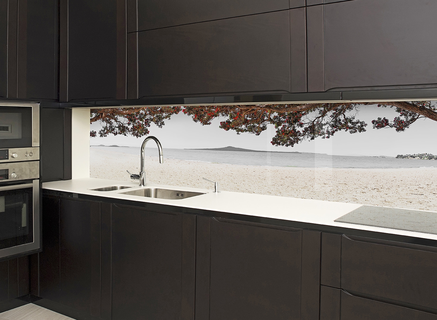
'Bolder' option
If you really love bright and bold images and you are planning in staying in your home for a long time then go for it !
(Image : Contemplation)
TIP 2 - What style is your kitchen ?
With more classic style kitchens you may want to think about choosing a more timeless image that is black and white with red or sepia tones or has a painted overlay. For a really contemporary kitchen you may want to choose an image that is more abstract in nature or maybe you have a beach themed kitchen with a sand flecked benchtop so a beach themed image works really well.

Contemporary style
Contemporary kitchens suit a wide range of splashback imagery including collages, cityscapes and seascapes.
Image : Abstract Paint

Classic kitchen
More classic designs suit monochromatic images, digital paintings and more muted colour tones which gives an air of sophistication.
Image : Tui Portrait
TIP 3 - What personality / atmosphere do you want to portray
The kitchen is the heart of the home where you spend many hours cooking and nowadays socialising so you need to decide what atmosphere you want to create in this space. The image you choose will set the overall feeling to the kitchen. The simpler images of textures, repeated patterns and the more arty digital paintings with muted colour tones are more sophisticated whereas the signage /graffiti collages are relaxed & edge and the bird artworks are light hearted and happy. Colourful landscapes, bush and nature images impart an uplifting relaxed feeling and the signage collages have a grungy urban relaxed feeling.

Sophisticated
The simpler images of textures, repeated patterns and the more arty digital paintings with muted colour tones create a sophisticated backdrop. Image : Flying Flax
TIP 4 - How ‘light’ is your kitchen, how much natural light does it get ?
If the kitchen splashback space doesn't get much natural light or there are deep overhead cabinets or dark cabinetry then choose an image that has lots of light tones or has bright colours. Don't choose a photo shot at night or a sunset image as it will be too dark in the kitchen and tend to darken the whole kitchen area. Install recessed cabinet lights in your overhead cabinets if possible. Also as a general rule, light / bright coloured images generally tend to lighten the perceived brightness of a kitchen and darker images tend to darken the perceived brightness of a kitchen.

Dark cabinetry ?
Choose an image with lots of light tones as a dark image will look too dark in the overall space and install overhead recessed cabinetry lights or an LED strip light to illuminate the splashback.
TIP 5 - What other materials and colours do you have in your kitchen ?
If you have an all white kitchen pretty much any image will look good. However if you have an all timber kitchen you may want to choose a nature theme to compliment the timber. If you have a black benchtop it can look good when the black benchtop merges into a black base of the image. A white benchtop looks good merging into white sand textures.

Dark benchtop
Dark benchtops look good with splashback images that have dark bases to them.
Image : Midnight Serenade (White Fantail)

Timber kitchen
With timber cabinetry you may want to continue the natural theme into the splashback imagery.
Image : Tui Portrait
TIP 6 - Do you already have a feature colour ?
Popular feature colours are Pohutukawa red, lush fern green and cyan blue. If you already have these colours in your furniture and accessories this may give a clue as to what image to choose for your splashback.

Feature colours
This kitchen had a feature colour of cyan blue to the bar front so this gave the customer guidance when looking for a complimentary splashback image.
Image : Eternal Home
TIP 7 - Where is the hob ?
This is often overlooked but the position of your hob is very important - is it centered in your splashback area or off-centre ? If you are choosing a Rangitoto option then often it looks best when Rangitoto is centered over the hob.

Off-centre hob
It often looks best if Rangitoto or the main focal point is centred over the hob.
TIP 8 - What size & shape is your splashback area ?
Simple rectangular splashbacks are the easiest to work with but so often the splashback returns around the walls and there are small strips under windows that need glass as well. Often the main splashback looks best printed and then all other small strips of glass can be produced as plain colour, matched to the wall so as not to detract from the main splashback. But every kitchen is different and sometimes I design printed splashbacks that are made up of 5 or 6 pieces all joining together and going around windows and corners. In these cases images that don't have a main focal point work well e.g. faintails on blossoms, flax silhouetes, toi toi - so the splashback is more of a continuous pattern rather than a photo with a focal point.

Multi-piece splashback
Often splashbacks can be created to go under windows and around corners. This photo was taken before the rangehood was installed so the splashback goes behind the rangehood and to the ceiling.
Image : Achilles Point Lookout - custom design
TIP 9 - Do you have lots of cutouts for powerpoints and switches ?
If you have lots of powerpoints or switches think about where they will be in relation to the image composition. You may be able to move the powerpoints to outside the splashback area otherwise you will need to make sure the main focal points of the image don't co-incide with the powerpoints.

Powerpoint colours
Often black powerpoint covers recede into the image more than white ones which stand out. Alternatively silver is a good option that is less obvious than white. However on a white background like this example white is the perfect choice.
Image : Fantail on Kowhai
TIP 10 - Lastly where are you located, what do you see out of your windows ?
You may decide to continue the theme of your views inside with your splashback e.g. if you have a tropical garden you could include this inside in your splashback. Or maybe you are in the bush and want to continue the bush theme inside.

What is your view ?
You can bring the outside in and continue the theme of your home with your splashback.
Image : Glass House
So now you have considered these points you can start narrowing down the best images for your kitchen splashback. And remember I will help you as much as possible with the process from superimposing different options into your kitchen photo through to adjusting image tones and compositions to get the desired 'WOW' result ! Please ask any questions by emailing me - lucygdesign@xtra.co.nz
“We renovated our house just over a year ago. Our favourite feature, and the one that everyone complements most, is Lucy’s splashback, a photo of a gannet soaring across beautiful Rangitoto. We looked at several photo options and Lucy guided us towards the right decision, and it was the right decision. She took charge of the production to ensure the printers delivered exactly what we wanted. We really appreciated her attention to detail and passion for the job. We highly recommend Lucy G!”